Evaluation, communication, illustration, visual tools
My contributions
The recent EvalForward discussion confirmed the potential of visual tools to do much more than just communicate evaluation findings. Visual tools, used effectively, can enhance the evaluation process itself.
Here are some of the ways our group members are using visual tools in 2023.
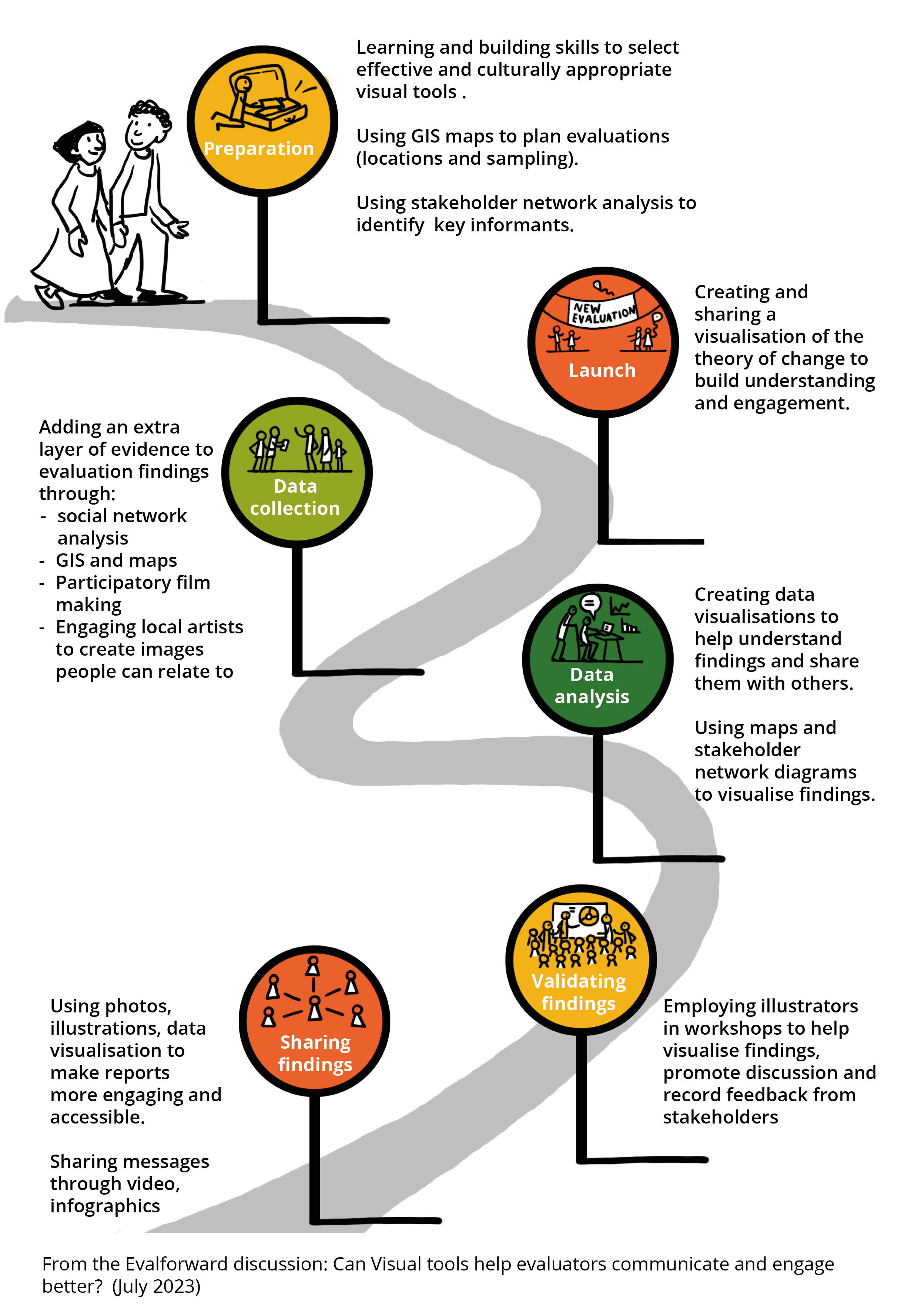
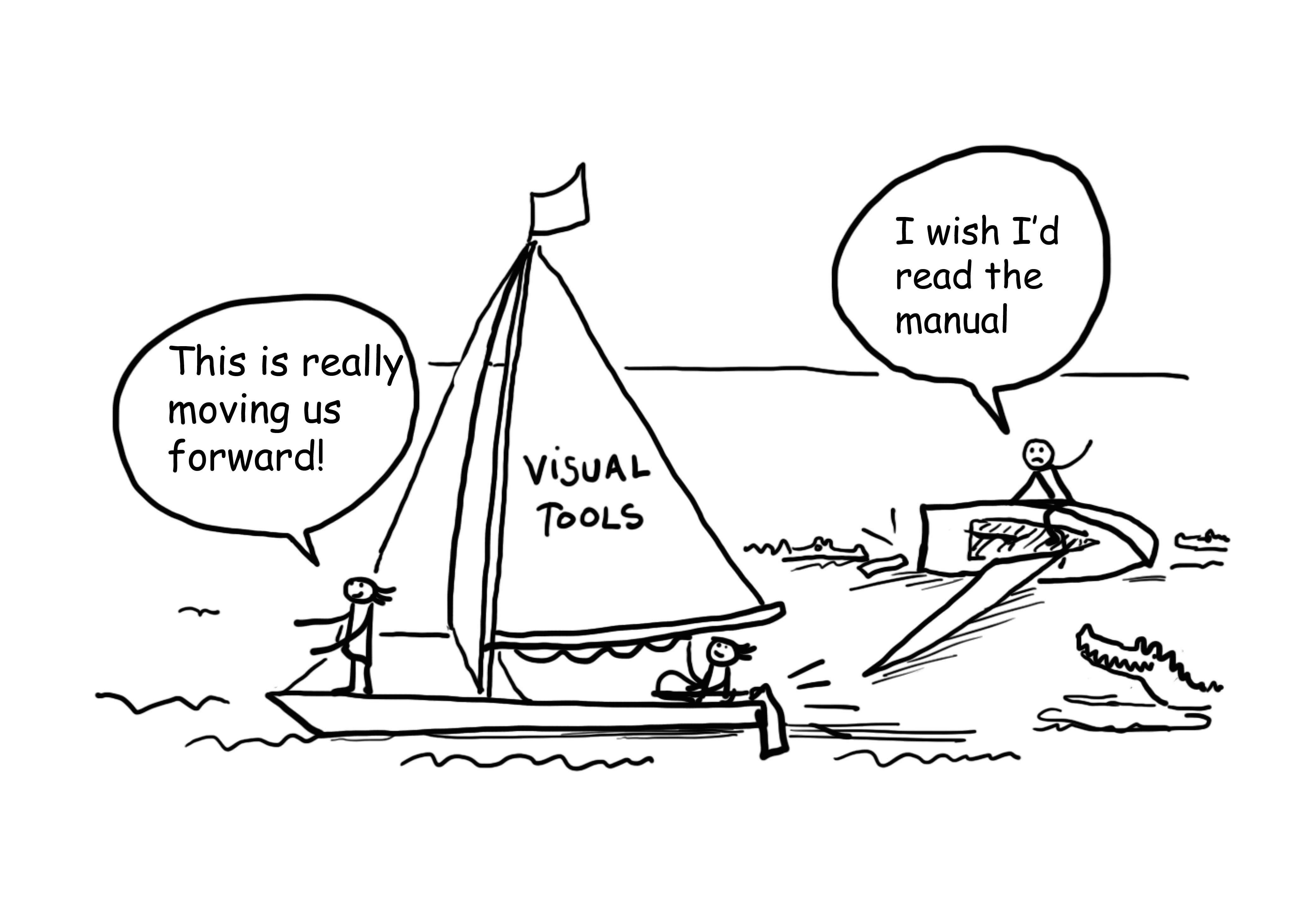
But participants in our discussion also gave us a warning. Tools as powerful as these cannot be used as ‘a cute add on’. They need to be handled with care!
As evaluators, we take enormous care with the language we use in our reports and verbal communication. An unclear report or inaccurate, culturally inappropriate statement can
Posted by
Harriet Maria Matsaert
FAOThanks Kombate for a great summary of the benefits of using visual tools. It is so interesting to hear how members of our community are using these tools to enhance the evaluation process as well as to communicate findings. I have found social network mapping really useful for working with stakeholders to understand and get insights into partnerships and communication flows. The social network maps can also be used to communicate these insights in a powerful way. The maps in the report Harvey shared are worth having a look at.
I’m interested to hear that UNDP and JICA are both including GIS (mapping and satellite data) in evaluations and finding this enhances the quality of the evaluation (for planning, as an extra layer of evidence and for communicating findings). Perhaps there are implications here for the training and resources we need to make available to our evaluation teams to allow them to benefit from these approaches?
If anyone is interested in some practical tips and tools for social network mapping in their evaluations have a look at the Net-Map tool box https://netmap.wordpress.com/about/ . Has anybody in the group used this?
Thanks Isha for telling us about JICA’s increasing use of pictorials in their reports. I found a nice example of a visual summary of their project evaluations here https://www.jica.go.jp/Resource/english/our_work/evaluation/reports/2021/iu2gj8000000ompj-att/glance_2021.pdf
Keisuke, your work continues to be an inspiration to me! It is so nice to see the visual of what success for WFP looks like in the Phillipines. I like the idea of creating a colouring competition so lots of people (and kids too) really look at it closely. Involving local artists in the evaluation visualisation process is also a great idea. Please do share the video with us when its ready.
Looking forward to hearing more experiences from the group!
Harriet Maria Matsaert
FAOThanks again for all your inspiring and thought-provoking contributions.
I realise I didn’t share anything yet about the way we are using visual tools in FAO’s office of evaluation (OED), where I’m currently based.
Our mission at OED (visualised below) is to enable well-informed decisions. One of the ways we are trying to achieve this (a pillar in the strategy model below…), is by creating communication products which are accessible and useful to our key evaluation users.
To do this, OED’s knowledge and communications team meets with evaluation teams to identify the key evaluation users and consider what insights from the evaluation will be useful to them. Based on this discussion, we work together to develop communication products to share relevant messages with different audiences. We use visual tools to make these messages more accessible to those who will not have the time or inclination to read a full evaluation report, or who may be interested only in a particular aspect of the findings.
The office has a call-down contract with a visual practitioner (me!) to create visual products as and when we need them. This ongoing arrangement allows us to respond quickly to opportunities, develop visuals in an iterative way and to fine tune and update our products as needed.
The products we have been testing so far include:
Whiteboard animations and videos:
short…
https://www.youtube.com/shorts/O33rOoVylSk
And longer…
https://www.youtube.com/watch?v=8S3BeOtpn9k&t=245s
Infographics: this one visualises a case study from the SDG 14 evaluation.
Visual highlights of evaluation reports
https://www.fao.org/evaluation/list/country-programme-evaluation-of-fao-in-jordan/en
Icons: this one represents one of FAO’s ‘four betters’ – better production
and cartoons
This cartoon was used in a webinar on our approach to meeting SDG goals.
Moving forward (and inspired by ideas coming from this discussion) I would like to see our team building feedback loops to monitor and improve the effectiveness of the various products and channels we use. I hope we will also be able to integrate visual tools more deeply into OED’s work: not only to communicate findings but to engage with stakeholders throughout the evaluation process, and to support the other pillars of our strategy in some of the ways described in this discussion group.
So, watch this space! A summary of our discussion and a blog will be available soon on the Evalforward website. I look forward to continuing to share ideas with you all over the coming months.
Harriet
Harriet Maria Matsaert
FAOThanks again for everyone’s great contributions to this discussion so far.
To help those who haven’t used visual tools yet, and to give the rest of us some ideas of what we could do to broaden and deepen our use of visual tools, it would be great to share any useful resources we know of: tools, resources, contacts… We can collate these and make them available on Evalforward after this discussion closes.
To start us off, here are some I have found helpful:
Guidelines (publications/videos/websites):
Tools
Videoscribe is a very user-friendly tool you can use to create short whiteboard animations (there is a free trial version) https://www.videoscribe.co
Netmap – for participatory social network analysis NetMap tool box: https://netmap.wordpress.com/about/
Services
The International Forum of Visual Practitioners has a network of practitioners working on every continent. Visit https://ifvp.org to find a practitioner near you.
Harriet Maria Matsaert
FAOEnjoying our discussion so far!