Can visual tools help evaluators communicate and engage better?
Dear Members
I would like to start a discussion on the potential of visual tools, like whiteboard animations and infographics, to help us communicate and engage better with evaluation stakeholders.
Over the last few years, I’ve been working with evaluation teams to create visual tools like whiteboard animations (see some examples here https://www.harrietmatsaert.com/case-studies/sharing-research-and-evaluation-findings ), infographics (see an example here https://www.harrietmatsaert.com/case-studies/explaining-a-process-or-idea ), to share evaluation findings.

I believe that these visual tools can help us reach a wider audience.
And, having reached them, present key messages in an accessible and memorable way so that our evaluations are more likely to result in learning and better-informed decision making.
I am also excited by the possibility of using visual tools earlier on in the evaluation process.
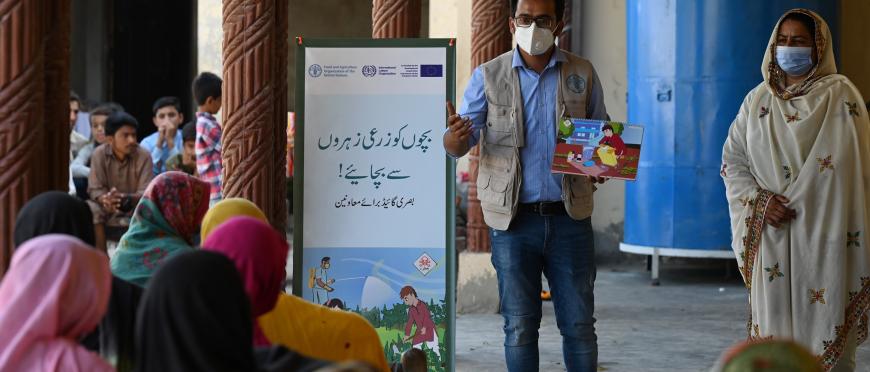
For example, the work of WFP’s Evaluvision initiative which is using participatory image development in validation meetings (see https://www.youtube.com/watch?v=8OS9neGPHr4)
This gives stakeholders an opportunity to see the ‘big picture’ of the evaluation findings and to contribute to the overall analysis (ensuring their perspective and evidence has been incorporated).
So, my questions to you are:
- What are your thoughts and experiences of using visual tools in evaluations?
- What kind of evaluation/stage of evaluation do you feel is most suitable for using visual tools?
- Any other insights or concerns about using visual tools?
- Do you have links or resources on using visual tools to share?
I’m looking forward to sharing ideas with you.
Harriet
Pamela Dianne White
Senior Manager Cowater International Finland OyHi Harriet,
Just wanted to congratulate you – very good examples here. The locust video in particular was a great product.
Best wishes, Pamela
Harriet Maria Matsaert
FAOThanks again for all your inspiring and thought-provoking contributions.
I realise I didn’t share anything yet about the way we are using visual tools in FAO’s office of evaluation (OED), where I’m currently based.
Our mission at OED (visualised below) is to enable well-informed decisions. One of the ways we are trying to achieve this (a pillar in the strategy model below…), is by creating communication products which are accessible and useful to our key evaluation users.
To do this, OED’s knowledge and communications team meets with evaluation teams to identify the key evaluation users and consider what insights from the evaluation will be useful to them. Based on this discussion, we work together to develop communication products to share relevant messages with different audiences. We use visual tools to make these messages more accessible to those who will not have the time or inclination to read a full evaluation report, or who may be interested only in a particular aspect of the findings.
The office has a call-down contract with a visual practitioner (me!) to create visual products as and when we need them. This ongoing arrangement allows us to respond quickly to opportunities, develop visuals in an iterative way and to fine tune and update our products as needed.
The products we have been testing so far include:
Whiteboard animations and videos:
short…
https://www.youtube.com/shorts/O33rOoVylSk
And longer…
https://www.youtube.com/watch?v=8S3BeOtpn9k&t=245s
Infographics: this one visualises a case study from the SDG 14 evaluation.
Visual highlights of evaluation reports
https://www.fao.org/evaluation/list/country-programme-evaluation-of-fao-in-jordan/en
Icons: this one represents one of FAO’s ‘four betters’ – better production
and cartoons
This cartoon was used in a webinar on our approach to meeting SDG goals.
Moving forward (and inspired by ideas coming from this discussion) I would like to see our team building feedback loops to monitor and improve the effectiveness of the various products and channels we use. I hope we will also be able to integrate visual tools more deeply into OED’s work: not only to communicate findings but to engage with stakeholders throughout the evaluation process, and to support the other pillars of our strategy in some of the ways described in this discussion group.
So, watch this space! A summary of our discussion and a blog will be available soon on the Evalforward website. I look forward to continuing to share ideas with you all over the coming months.
Harriet
Keisuke Taketani
Graphic facilitator FreelanceHi everyone,
I really enjoy the active discussion. It seems that we realize there are many aspects of visualization in terms of tools, audience, and purpose, and this is just the beginning of the beginning.
Coincidentally, I received a notice this morning that specialized online training in data visualization and evaluation is launched.
https://lovingvisuals.com/.
The person behind the course is someone I can trust in both evaluation and visualization. This could be a good venue for anyone who wants to use more visualization in evaluation reports and more.
Cheers,
Keisuke
Keisuke Taketani
Graphic Facilitation and Design
www.keisuketaketani.com
Aparajita Suman
Kaizen, a Tetra Tech CompanyVery useful insights Silva. You are right that visuals are usually cute add-ons/ after thoughts. It's high time we get trained/ skilled and create a pipeline of experts and practitioners who can communicate in other languages/ mediums.
Best
Aparajita
--
Dr. Aparajita Suman
Advisor- Knowledge Management
Coalition for Disaster Resilient Infrastructure
Dreni-Mi Mahamat Djimé
Assistant au Secrétaire Général du Ministère de l"Agriculture Ministère de l'Agriculture/Ancien Directeur des Etudes de la Planification et du SuiviHello everyone!
I have followed with great interest these discussions on the use of visual tools to improve communication. It's quite obvious, as we are often used to introducing images and drawings into our presentations, and we also use these tools when drawing up social maps with the communities to convey our messages as effectively as possible. However, I would also like to point out that it would be difficult to share the results of an evaluation exclusively with visual tools, as we are often faced with multicultural, multi-ethnic and multilingual environments.
[Translated from original in French]
Silva Ferretti
Freelance consultantThanks Harriet for sharing all these tools. Really useful!
However... a friendly warning.
Using visuals is not just about tools. Visuals are an attitude; they are languages with rules and challenges.
Just as having access to "Word" (and other word processors) does not guarantee you can write effectively, using visual tools does not ensure good visual communication.
Unfortunately, in our world, visuals are just an add-on.
Writing is the default; then, we can add a cute visual.
And in many cases, such visuals are bad, possibly harmful.
I remember pointing out to some colleagues that their visuals had challenges and that they could be misinterpreted.
And they just shrugged their shoulders, not seeing the issue.
"It is just a graph; why do you worry so much about petty details?"
These colleagues would be anal about a wrong comma in their text, yet they shared visuals contradicting their messages without caring, without even seeing the point.
So... by all means, try to become conversant with visuals.
But take the time to learn the language, ask for feedback, and be humble.
We do need more languages - beyond the written one - in evaluation.
But there is a vicious cycle: because now the written word is predominant, experts and practitioners are predominantly "writers and readers" and might resist other languages.
Visuals are cute, but what matters is a written report. So it is predominantly writing people that will be enrolled.
This is a major issue, blocking appropriation by people with different communication preferences and leading to ineffectively sharing messages that would be better shared visually, theatrically, or in other languages.
And, if you think that "nice, but if it is not written in words, it is not reliable, credible, acceptable..." you are part of the problem! :-)
So... be inspired by the great tools and resources shared by Harried (thanks!), and explore visuals. But do remember that they are not an add-on.
They are a needed language to master but challenging to use well! :-)
Nicola Theunissen
Communications consultant World Food ProgrammeDear Harriet,
What a great discussion, and so many interesting reflections! I like Kombate’s point on visual tools’ ability to increase impact. Coming from a media background, I can concur that the use of visual tools during the evaluation process enables a more compelling story to be told after the evaluation has been completed (and published) – or while it is being conducted, for that matter.
On the point of learning, the WFP Office of Evaluation has conducted an evaluation stakeholder survey on communication products and evidence use. Some findings below:
Translating evaluation info into a visual language requires niche skills that could be context-specific and culturally sensitive. I’m a big advocate of using visualization in evaluation processes and products; however it’s important to consider that specific audiences may still require text-based info (using visualization as an aid to the message); while others may prefer to receive the entire message in a visual format. Understanding audiences’ specific information needs are therefore critical to achieve the evaluation’s purpose and use.
Harriet Maria Matsaert
FAOThanks again for everyone’s great contributions to this discussion so far.
To help those who haven’t used visual tools yet, and to give the rest of us some ideas of what we could do to broaden and deepen our use of visual tools, it would be great to share any useful resources we know of: tools, resources, contacts… We can collate these and make them available on Evalforward after this discussion closes.
To start us off, here are some I have found helpful:
Guidelines (publications/videos/websites):
Tools
Videoscribe is a very user-friendly tool you can use to create short whiteboard animations (there is a free trial version) https://www.videoscribe.co
Netmap – for participatory social network analysis NetMap tool box: https://netmap.wordpress.com/about/
Services
The International Forum of Visual Practitioners has a network of practitioners working on every continent. Visit https://ifvp.org to find a practitioner near you.
Shweta Anand
Assistant Professor Lady Irwin College, University of DelhiDear all,
as mentioned in an earlier comment by Harvey Garcia, Social Network Analysis (SNA) is an interesting tool to use in evaluations. I am currently part of a team working with CGIAR Evaluation Function. We are evaluating CGIAR Genebank Platform and planning for a SNA which would help CGIAR and Genebanks identify key nodes/actors/partners and study their relationships and interaction patterns to explore how relevant and effective the Genebank Platform has been and how well the platform catered to the needs of its users and partners.
SNA is often used to analyse and improve communication flows in within organizations or with their network of partners. It is helpful in visualization of data so as to uncover patterns in relationships and interactions.
For this specific evaluation, the analysis will provide useful insights in terms of assessing the existing communication flows and how these relationships can be used to further strengthen the functioning of the organization and/or CGIAR initiative.
In the present evaluation, SNA will help:
The questions to chalk the patterns of interactions and identify strengths of the relationships will be incorporated into the online questionnaire or interviews used for the evaluation and will be analyzed using Gephi or any other online SNA tool like Pajek or UCINET.
Lillian De Bortoli
Court Services Victoria AustraliaDear Harriet,
Thank you so much for sending this through.
I am currently working on establishing an evaluation framework for courts in state of Victoria, Australia. Your diagram provides an excellent overview of how I can conceptualise the framework, as I consider existing gaps, building capability and growing an overall culture of evaluation and evidence based decision making. Certainly, the visual tool brought the message home to me!
Many thanks again.
With kind regards,
Dr Lillian De Bortoli (she/her)
Manager, Performance and Evaluation
User Experience, Data and Insights
Wurundjeri Woi-Wurrung Country
Maurice Otieno Mando
P.A Amref Health Africa in UK(Coast Region and Kajiado)Visual tools play a pivotal role in improving communication and engagement for evaluators. These tools provide valuable support by enhancing the clarity and understanding of complex information. Evaluations often involve working with extensive or intricate data, and visual aids such as charts, graphs, and infographics enable evaluators to present this data in a more accessible format. By visualizing data, patterns, trends, and relationships become more apparent, enabling evaluators to effectively communicate their findings to stakeholders.
Additionally, evaluators frequently analyze complex systems or processes. In such cases, visual tools like diagrams, flowcharts, and conceptual models prove invaluable. These visual representations offer a clearer understanding of the interdependencies between various elements within the system, facilitating discussions and collaborations among stakeholders. By providing a common language and visual reference point, these tools aid in conveying information effectively and engaging stakeholders more actively.
Furthermore, visual tools contribute to storytelling and narrative techniques during evaluation reporting. Incorporating visuals such as images, illustrations, or videos in presentations and reports enhances their impact, making the findings more engaging and memorable. By leveraging visual storytelling, evaluators can effectively convey their message, evoke emotions, and capture the attention of stakeholders, resulting in better engagement and comprehension of the evaluation outcomes.
Participatory evaluation processes can benefit significantly from visual tools. Techniques such as mind mapping, concept mapping, and collaborative visualizations promote active engagement among stakeholders. These tools facilitate group discussions, brainstorming sessions, and consensus-building exercises. By encouraging the expression of diverse perspectives and fostering a sense of ownership among participants, visual tools enhance engagement and collaboration.
In conclusion, visual tools serve as essential aids for evaluators, enabling them to communicate complex information more effectively and engage stakeholders. Through data visualization, conceptual models, storytelling techniques, and participatory approaches, visual tools enhance understanding, promote collaboration, and increase the impact of evaluations. By leveraging the power of visuals, evaluators can effectively convey their findings, capture the attention of stakeholders, and facilitate meaningful discussions and decision-making processes.
Harriet Maria Matsaert
FAOEnjoying our discussion so far!
Mustapha Malki
Independent consultantDear Ram,
I thank you for this interesting theme which got me back to the a period between 1996 and 2002 wherein I accumulated a great practical experience with the use of participatory tools in community development, and hence discovering Robert Chambers' philosophy of participation. Involving development beneficiaries in drawing themselves social and resource maps, mobility/historical maps and transects, etc. was not so easy as we were a team of community and participatory R&D specialists seeking to apply Robert Chambers' philosophy in its deepest sense, that is: IT IS NOT THE FACT OF USING PARTICIPATORY TOOLS THAT MAKES US "PARTICIPATORY-ORIENTED" BUT IT IS THE WAY OF USING THEM. And that way was, for us, not to make development beneficiaries speak and then it is for us to spot their information on a participatory tool but rather to train them on the use of these tools and then assist them in the field exercise while they draw some of these tools. And that way made all the difference for us to learn from them – YES we learned from them before they started learning from us – and understand very well their mindset and thoughts. Though later, we did re-spot all needed information from what we collected on some geographical maps to make things clearer and included all tools drawn by beneficiaries as parts (or annexes) of our reports.
And just to conclude, it is not useless to say again that participatory tools are good visualization tools to enhance beneficiary participation and communication in all development activities.
Kind regards
Mustapha Malki, PhD
MEL Specialist
ABLAYE GAYE
PRÉSIDENT Président comité local thies de RACINES (Réseau des Acteurs et Initiatives et Économiques , Écologiques et Solidaires)Dear colleagues
I believe that visual tools can make data more accessible and understandable for stakeholders who are not experts in the field. This can help to promote transparency and commitment in the assessment process.
However, even if we are talking about visual evaluation, we need indicators that really define what the visual tool is and what its role and importance is.
Layepresi
ablayegaye462@gmail.com
Musa K. Sanoe
National M&E Specialist United Nations Food and Agriculture Organization (FAO)Dear Daniel,
Great we generally agreed on some points about evaluation. But to your point, "evaluations" commissioned and paid for by the Liberian govt that assess donor performance incl the FAO in the agriculture sector?
To the best of my knowledge, I think our gov't is doing some sort of donor performance assessment. These assessments cover all sectors including agriculture. The most recent was the 'Joint Sectoral Portfolio Performance Review' held on June 19-29, 2023. The review takes stock of all interventions in different sectors in relation to government priorities. The exercise is a holistic approach to evaluating sectoral performance which cut across donors. https://frontpageafricaonline.com/news/government-of-liberia-collaborates-with-united-nations-and-development-partners-for-sector-portfolio-review/)
In addition, the Ministry of Finance and Development Planning has a system for assessing IPs, during their reaccreditation. Technicians do an assessment of the previous interventions, as a prerequisite for obtaining accreditation, and even sectoral clearance.
Silva Ferretti
Freelance consultantgreat point Ram… may i just suggest that mechanical evaluations serve mechanical compliance, and not accountability? (especially if we aspire to be accountable to the primary stakeholders… and to mindful donors)
Ram Khanal
Advisor Community of Evaluator (COE) NepalDear all,
A lot of colleagues have mentioned the usefulness of visual tools for better communication.
I echo the usefulness of the approach. I have noted that the visual tools – the language with universal clarity - help to communicate (during evaluation and after evaluation) easily as the tools address language barriers with multiple cultural and literacy levels among the groups. This is more useful while engaging development beneficiaries. In my experience, people become more cooperative, understand the context and objective easily and help to create quick awareness, better response and cross-learning.
But, these evaluations, in many cases, become a mechanical process with a long-written report (with so-called advanced English which is not generally understood by the many stakeholders) that serve the purpose of accountability but not for learning. In participatory evaluation, I have some experience using visual tools such as social–resource maps, Venn diagrams, mobility /historical maps and community score card for different purposes. The tools can be developed based on the needs/context but optimum use of the tools may provide better results.
With best regards,
Ram
Daniel Ticehurst
Monitoring > Evaluation Specialist freelanceDear Musa,
Your point on donor-led evaluation and its consequences are largely correct - Dahler-Larsen's evaluation machines.
"Steering, control, accountability, and predictability come back on the throne. The purpose of evaluation is no longer to stimulate endless discussions in society, but to prevent them."
Thing is, donors pay for and design them. What does this say about evaluation capacity within donor agencies? And I'm not referring to academic expertise on methodology (the supply side, rather the politics of the demand side).
For example, DFID's, now FCDO, evaluation function has never been independent - it's been hidden under the broader research function - with inevitable consequence. Tony Blair was proud of his lack of adaptability in not having a reverse gear or changing course. No surprise that an independent review rated DFID as red on learning and found that
“Staff report that they sometimes are asked to use evidence selectively in order to justify decisions.”
It is often the most rigid and bureaucratic organisations that congratulate themselves on being a learning organisation. This happened, not because DFID did not have many excellent and competent staff, rather because of how powerful political and institutional imperatives crowd out time to think, reflect and be honest.
As an aside, have you /do you know of any "evaluations" commissioned and paid for by the Liberian govt that assess donor performance incl the FAO in the agriculture sector?
Musa K. Sanoe
National M&E Specialist United Nations Food and Agriculture Organization (FAO)I agree with Silva Ferretti's point, that evaluations are not the lengthy reports we write. Unfortunately, long reports remained the main expected products. I think this is because we are using evaluations as a donor's requirement rather than for our own learning purposes, and a tool for improvement. The moment we go away from seeing evaluations as donor's requirements we will start to be more inclusive, and participatory in all our evaluation processes including developing processes that are more inclusive for all. My emphasis is actually on people who do not understand the meaning of 25%, and 40%.
Daniel Ticehurst
Monitoring > Evaluation Specialist freelanceDear Harriet,
Many thanks for prompting this discussion and, as Paul said, for the links to specific examples. Really helpful.
I liked the example of the work with Financial Services Deepening Kenya (FSD) Kenya in Marsabit and how it involved FSD Kenya brokering partnerships with CARE and Equity Bank [link here] (It would be interesting to find out, given this all started in 2016, to what extent the groups in Marsabit are faring and whether they remain dependent on CARE's sub-contract with FSD Kenya. For Equity Bank, i wonder whether the savings products they sold to the groups have found "markets" beyond Marsabit.)
Moving on, i wanted to share my first experience of using visual tools back in the early 1990's in Bangladesh on an irrigation project, lessons from which i still take heed of. They respond to your first two questions.
I am doing this for two reasons. First, i agree with Silva Ferretti that use of visuals tools are not just about communicating the "result" of an evaluation, but also an integral part of the process - as Kombate says re: data collection and analysis . Second, reference made by Harvey on the use of GIS and Landsat TM imagery.
We "measured" the area of land irrigated in specific communities through 'pictures' / Landsat images of the country over a three year period. We found out how irrigated areas varied significantly between communities in the same year and over time for the same community. We wanted to find out why. Rather than staying in the office, we took hand drawn maps for each community down down from the landsat images and took them with us. Through focus group discussions we presented these maps to each of the communities. The discussions focussed on us listening to the groups discuss why and how the demand for irrigation water varied so much. The 'results' from these discussions informed not only lessons for the community in managing irrigation facilities, but also for local upazilla govt support and the implications for national policy. For me, it was a lesson as to how if you want to find out why and how people respond to national level interventions, just go ask them and learn from them how they make decisions and why. Far better this, than staying in the office and further manipulating data.
I hope the above is not too terse and crude a contribution, and thanks again.
Best wishes,
Daniel
Silva Ferretti
Freelance consultantEvaluations are not "written reports".
Evaluations are processes to understand if, how, and to what extent the programme produces change (expected and unexpected).
If you embrace this view, then communication is clearly at the core of it: to communicate purpose, to elicit ideas, and to formulate and share findings.
Unfortunately, evaluators are most often conversant with written words and not with other forms of communication.
This greatly limits engaging stakeholders and sharing findings, as other people might prefer other communication methods.
In my experience, just about anything works better than reports: cartoons, graphs, infographics, theatre, music, multimedia, etc.
(yes, I tried them all. and they were welcomed by all sorts of stakeholders, including donors)
Evaluators should not just think "report". They should think about the best combination of different ways of communicating.
Illiterate people can perfectly understand visuals - if visuals are properly set -
Participatory toolboxes contain ideas for showing and discussing percentages through visual aids.
Definitely, they are more likely to understand visuals rather than reports written in English...
Of course, if we understand "visuals" only as Excel graphs, we miss a whole world of possibilities.
And visuals cannot be improvised: as there is a grammar to write words, there is also grammar and a style to produce visuals.
Even looking at the specifics of data charts, there are whole books on data visualizations, offering examples (and also highlighting potential challenges for miscommunications). A simple visual can go a long way. But a good visual is not simple to do.
Definitely, let's go beyond the written word. But let's remember that this cannot be improvised.
Thierno Diouf
Strategic planning, Monitoring, Evaluation and Research, Learning and Adaptation Founder and Executive Director 3DLabLal - Manavado
Consultant Independent analyst/synthesistGreetings!
I read with some interest the original e-mail on this topic and the first responses. However, I am a little puzzled: it is obvious that any evaluation can only be undertaken relative to a certain given objective. For me, the only justifiable objective of an evaluation is to ascertain whether a project, programme, etc could or had achieved its intended purpose towards the target group. Such a group may be a group of strategists, designers of operation or field work.
As far as I can see, it is difficult to understand how such an objective - reaching the target population - may be visualized. Without such an anchor, the visualizations would be left adrift like a ship with engine failure in a stormy sea.
Cheers!
Lal Manavado.
Musa K. Sanoe
National M&E Specialist United Nations Food and Agriculture Organization (FAO)I am a new member of this important forum and a group of professionals. Interesting discussion point, Can visual tools help evaluators communicate and engage better?
I have no doubt that visualizations are important tools for communicating and engaging better, especially with stakeholders. My only concerns are, what kind of visualization, and which stakeholders? For example, in my country, Liberia where the vast majority of the stakeholders and specifically beneficiaries are illiterate. Of course, presenting fancy charts/graphs, tables in percentages, are really meaningless and won't communicate anything to them at all. An evaluation is supposed to promote accountability. This places explicit responsibility on us as evaluation practitioners to share with our beneficiaries (I mean illiterate ones). Charts/ tables and other visual aids may not communicate anything substantial to these people. For example, 25%, and 40% on charts and table has no meaning to them. Extract innovations are required to factor these people amongst stakeholders that require to participate in the sharing of the evaluation's findings. I have pilot-tested sharing evaluation findings with this group of people without using nice charts, and tables.
Harriet Maria Matsaert
FAOThanks Kombate for a great summary of the benefits of using visual tools. It is so interesting to hear how members of our community are using these tools to enhance the evaluation process as well as to communicate findings. I have found social network mapping really useful for working with stakeholders to understand and get insights into partnerships and communication flows. The social network maps can also be used to communicate these insights in a powerful way. The maps in the report Harvey shared are worth having a look at.
I’m interested to hear that UNDP and JICA are both including GIS (mapping and satellite data) in evaluations and finding this enhances the quality of the evaluation (for planning, as an extra layer of evidence and for communicating findings). Perhaps there are implications here for the training and resources we need to make available to our evaluation teams to allow them to benefit from these approaches?
If anyone is interested in some practical tips and tools for social network mapping in their evaluations have a look at the Net-Map tool box https://netmap.wordpress.com/about/ . Has anybody in the group used this?
Thanks Isha for telling us about JICA’s increasing use of pictorials in their reports. I found a nice example of a visual summary of their project evaluations here https://www.jica.go.jp/Resource/english/our_work/evaluation/reports/2021/iu2gj8000000ompj-att/glance_2021.pdf
Keisuke, your work continues to be an inspiration to me! It is so nice to see the visual of what success for WFP looks like in the Phillipines. I like the idea of creating a colouring competition so lots of people (and kids too) really look at it closely. Involving local artists in the evaluation visualisation process is also a great idea. Please do share the video with us when its ready.
Looking forward to hearing more experiences from the group!
Keisuke Taketani
Graphic facilitator FreelanceDear Harriet,
Many thanks for starting a discussion close to my heart!
Let me share the latest development of WFP EvaluVision, as you kindly shared as an example. After trying to set a foundation of methodology, EvaluVision is now focusing on finding and strengthening local talent. WFP Nepal conducted a stakeholder workshop to discuss a baseline study of the school feeding program. I worked with a local artist to share the overall EvaluVision methodology. A documentary video is being edited at this moment, so I might be able to share it before this discussion closes.
Besides EvaluVision, I recently asked to help several WFP country offices to visualize the Theory of Change. After going through several technical workshops to formulate ToC, it was suggested to make a one-page visual without any technical terms. I proposed that, after drafting an illustration, organize a coloring contest where any staff or their family can participate. The winner was the daughter of the WFP staff. I realize this is more like a vision board than a Theory of Change, it helps to explain the overall purpose (how success looks like) and how we get there. More details and the winning entry on a LinkedIn post here
Another use, as wisely pointed out by Harvey Garcia in earlier posts is a crossroad of evaluation and data analysis. I see a big potential for using big data for evaluation. I am not a data scientist who can share many insights, but please allow me to share a graphic summary of a very interesting discussion of evaluation and artificial intelligence organized by EBRD last year. I suppose it's not so far future when AI will create a summary drawing if you upload a 100-page evaluation report. (or maybe is there such a tool available already?)
Cheers,
Keisuke
Keisuke Taketani
Graphic Facilitation and Design
www.keisuketaketani.com
Isha Miranda
Visiting Lecturer and Independent Evaluator Independent ConsultantThere are many positive outcomes of utilization of visual tools
The most crucial elements are:
Challenges are: Online surveys need data accountability and identification of the surveyor and surveyee.
Harvey Garcia
Senior Evaluation Specialist United Nations Development Programme, Independent Evaluation OfficeHi Colleagues,
Very interesting topic. I feel that visual tools in the evaluation practice are underutilized and are mostly an afterthought after the evaluation report has been produced, which should not be the case. Well, I think now there are renewed interest in using data visualization to communicate not only evaluation results but also the process. Visualization is also now being used to plan, gather and add another layer of evidence in an evaluation. I remember when I was in FAO OED, we used Social Network Analysis (SNA) as a visualization tool to identify and prioritize stakeholders for Key Informant Interviews and also to assess the positioning of FAO https://www.fao.org/3/i8564en/I8564EN.pdf. In UNDP IEO, we also started using SNA for countries with Humanitarian Crisis situations since there is limited access and time in the field to conduct evaluations related activities.
GIS is also a form of visual tool. Its use in evaluation is rather limited and mostly seen in project evaluations and some thematic evaluations (mostly related to forestry and infrastructure). In multi-themed programme evaluation (i.e., country programme evaluation), its application has not been fully maximized. In UNDP IEO, we have started mainstreaming use of GIS as a data visualization tool to plan evaluations, contribute as evidence, and communicate our findings to the stakeholders. Our latest Independent Country Programme in Cambodia highlights the use of GIS. We actually published our experience in the first edition of the Asia Pacific Evaluation Journal. Here is the link to the article:
https://drive.google.com/file/d/10LeQeCEC8ee2Kn6FTGAbLaau7cEphknQ/view
Harvey John D. Garcia, Senior Evaluation Specialist
Independent Evaluation Office, UNDP
Kombate Yendoukoa Nawanti
Agricultural Economist | Monitoring and Evaluation Specialist University Of KaraHi Harriet,
I'm Kombate, a young evaluator from Togo (a country in western Africa).
I've carefully read your mail in the evalforward group, and I would like to share with you my thoughts on visual tools in evaluation (I'm not an expert. I'm just sharing my opinion, considering my passion about data visualization).
1- Using visual tools in evaluations as a plus can
Visual tools can help people to understand complex information more easily and to engage with it more deeply. This is because they appeal to our natural tendency to process information visually.
Visual tools can help to communicate evaluation findings in a more clear, more concise, and more engaging way. This can be especially helpful when communicating with stakeholders who may not be familiar with evaluation terminology or concepts.
Visual tools can be used to facilitate collaboration between evaluation stakeholders. This is because they provide a common language and framework for discussing evaluation findings.
Visual tools can help to increase the impact of evaluations by making them more accessible and memorable. This can lead to better decision-making and improved outcomes.
2- Types of evaluation/stages of evaluation that are most suitable for using visual tools
Visual tools can be used effectively at all stages of the evaluation process, from planning and design to implementation and reporting. However, they are particularly well-suited for use in the following stages:
Visual tools can be used to help to clarify the evaluation questions, identify the target audience, and develop the evaluation plan.
Visual tools can be used to collect data from stakeholders, such as through interviews, focus groups, and surveys.
Visual tools can be used to help to analyze and visualize data. This can help to identify patterns and trends, and to communicate the findings to stakeholders.
Visual tools can be used to create reports that are more engaging and easier to understand. This can help to increase the impact of the evaluation.
3- Other insights or concerns about using visual tools
There are many different types of visual tools, and each one has its own strengths and weaknesses. It is important to choose the right tool for the purpose of the evaluation.
This means using clear and simple language, and avoiding jargon. It is also important to consider the cultural context of the stakeholders.
Visual tools can be a powerful way to communicate information, but they cannot replace the need for clear and concise written text.
Best regards.
Kombate Nawanti
Project analyst at ShARE
Master Degree in Monitoring and Evaluation
Republic of Togo